|
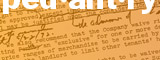
About me, the pedant
Crimes of illiteracy
Crimes of innumeracy
New York City solecisms
Writing for the Internet
Proofreading services
Resume
Links


|
Writing for the Internet
If some of the punctuation on this site surprises you, it's because of
Internet limitations.
My Web site used to adhere to the same laws of fastidiousness that I apply to
printed documents, but when question marks started appearing in Google search
results from my site, I realized I had to tone down my picky use of en dashes,
curly quotation marks, and ellipses. The fact is that some computers' character
sets don't parse these characters correctly.
So, for this site, and in e-mail messages, I make the following
modifications:
- " - " instead of a long (em) dash. Yes, that's a plain old
hyphen flanked by spaces. I know that the traditionally correct
representation of an em dash is two hyphens, but some browsers and e-mail
programs will split two hyphens at a line break.
- "-" instead of an en dash. Most people don't pay much attention
to en dashes anyway, so there's not much to be lost by using hyphens
instead.
- Three periods ("...") instead of an ellipsis. True, the periods
should be separated by spaces, but I don't trust all browsers to keep the
periods together on the same line, even if the spaces are nonbreaking (hard)
spaces.
- Straight quotation marks instead of curly quotation marks. This site uses
the Arial typeface, which on most Windows computers doesn't distinguish
straight and curly quotation marks at small point sizes. Thus, many readers
will see no difference, and it's a heck of a lot easier for me to hit the
single-quotation-mark key once than to press Alt-0146.
- Commas and periods outside the quotation marks. In this age of passwords
and funky-looking URLs, it's often important to distinguish whether a comma
or period is actually part of the text in quotation marks. If I'm told to
type "this," I'll type five characters. If I'm told to type
"this", I'll type only four.
- Removal of accent marks in English words. I used to put them in words such
as "cafe" and "resume," but since not all computers show
them correctly, I can make do without them. In other languages, however,
they are important: The Spanish words "lena" and "leńa"
have very different meanings. You'll find lots of accents on my travelogue
for the trip that included Mongolia and Hungary.
Here's some more advice for writing e-mail messages: Keep to simple text.
Many e-mail readers, especially Web-based ones, can't handle bold and italic
formatting, colors, and bullets, and such decorations usually needlessly add to
the size of the message. Use capital letters for headings, a row of dashes for
separators, and a raised dot (·) as a makeshift bullet (almost all computers
can handle that character). On Windows machines, the raised dot is Alt-0183 on
the number keypad (if Num Lock is on). On the Macintosh, it's Option-Shift-9.

|
